
UX/UI DESIGN, 2025
Transplant
Role: Product Designer, User Experience Researcher
Overview
A startup focused on helping people form new in-person friendships has identified a gap between RSVP numbers and actual event attendance—only about 20% of those who commit to an event end up going. The startup aims to ease the challenges of making friends in a new city, and accordingly, the core of its user base is made up of socially anxious individuals (particularly middle-class adults aged 32–55) who have recently relocated.
The business goal is to reduce the gap between RSVP numbers and actual event attendance through better communication and low-cost incentives. The brand seeks to connect with users as a trusted, optimistic, and caring friend, drawing inspiration from platforms like Meetup, Facebook, and Eventbrite.
Contents
Final Prototype
THE QUESTION
How might we design an event-finding experience that builds trust and commitment among socially anxious adults new to a city—so that RSVPs translate into real-world attendance?
RESEARCH
User Interviews
To better understand why a user may RSVP to an event without attending, I conducted a series of interviews with individuals who match the startup’s target audience. These interviews revealed the following themes.
Desire for Structure and Predictability:
Users overwhelmingly preferred structured events with clear activities or timelines—like trivia, sports, workshops, or climbing—because predictable formats lower social pressure, reduce anxiety, and make it easier to mentally prepare and commit compared to unstructured mixers.
Social Anxiety around Solo Attendance:
Users are hesitant to attend events alone, and pre-event anxiety—especially when it’s unclear whether solo attendance is normal—creates a major barrier, making them far more likely to follow through when they have a companion or know others will also be attending solo.
Need for Specific and Transparent Details:
Users are far more likely to commit when event listings clearly communicate details like expected crowd size, audience type, social expectations, schedule, and whether alcohol is involved—since vague or incomplete information creates uncertainty and drives drop-off.
Cost, Time, and Energy Investment Matter:
Users are more willing to attend when events are low-cost, low-effort, and nearby—since uncertainty about enjoyment makes them unwilling to risk more than $10–20 and pushes them toward approachable, low-commitment options.
RESEARCH
Competitive Analysis
To understand how existing event-discovery platforms engage users, I analyzed Facebook Events, Eventbrite, and Meetup across onboarding, discovery, event details, and RSVP flows. Eventbrite excels in clarity and hierarchy—its ticketing and checkout experiences reduce friction and communicate trust—but it risks overwhelming users with multiple sign-in prompts and visual clutter.
Facebook Events drives strong engagement through social context (“friends are interested”), yet its interface suffers from excessive visual noise and ambiguous RSVP language. Meetup offers personalization through interest tags and community-based discovery, but its event surfaces feel fragmented and often gate participation behind group membership, creating barriers to entry.


Across all three, common challenges included information overload, inconsistent social proof, and limited personalization transparency. However, their strengths informed key opportunities for Transplant: simplifying event browsing through focused filters, offering multiple engagement levels beyond “interested” or “going,” and surfacing social motivation cues without sacrificing clarity. These insights shaped design priorities around trust, simplicity, and community belonging—making Transplant a more streamlined and emotionally intelligent event platform.
RESEARCH
User Personas

The Cautious Social Explorer
“I want to go out more, but I always talk myself out of it — it’s hard when you don’t know what to expect or who to go with.”
Goals:
-
Find approachable, small-scale events that feel inclusive
-
Connect with people who share authentic interests
-
Reduce anxiety around showing up alone or not knowing anyone
Frustrations:
-
Event listings feel impersonal and overwhelming
-
Doesn’t know how to gauge the “vibe” of an event beforehand
-
Experiences “RSVP guilt” — signs up, then cancels last minute due to nerves

The Intentional Regular
“If I could see which events I'd actually enjoy and which help me meet people I connect with, I’d go out twice as often.”
Goals:
-
Discover events that align with specific interests
-
Track attendance history and engagement over time
-
Build and maintain social routines
Frustrations:
-
Event listings feel random and inconsistent
-
Wants to access information about other attendees without having to pay for a subscription (as with Meetup)
IDEATION
User Flows
After initial user research, I mapped user flows to clarify how people decide to RSVP based on confidence in their interest. My hypothesis: the more assured users feel about enjoying an event—and the more prompted they are to update their RSVP—the smaller the gap between RSVPs and actual attendance.
Selecting and RSVP'ing to an Event:
.jpg)
USER TESTING: RD1
Low-Fi Test Findings
I turned my user flows into low fidelity wireframes and performed three user testing sessions to stress-test my ideas. The following are the strongest insights I gained from this round of testing.
Home Screen:
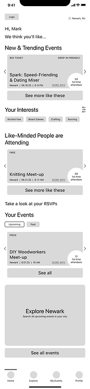%201.png)
First event options shown on home screen do not reflect user’s interests, though user interests are the most important factor in choosing event
Testers appreciated the inclusion of "number of first time attendees"
Testers expect "Your Interests" to be present at the top of the scroll if it dictates recommendations
Event Screen:

Testers appreciated having logistical information featured at top of scroll
There was confusion about the redundancy of these tags with the tags below
Testers liked this detail
Tester consensus: real reviews from past attendees are more valuable than FAQs curated by event host
Solutions:
-
Switch the order of “New and Trending Events” and “Like-minded People are Attending.”
-
Move "Your Interests" filter to the top of the page.
-
Reconceptualize the "what to know" section with a visual that will better describe the event's makeup.
-
Add "review event" feature/user flow, so that reviews can be added to an event's detail page.
USER TESTING: RD2
High-Fi Test Findings
Next, I developed a high-fidelity prototype and performed five testing sessions with the prototype to make sure that the process of finding an interesting event, and RSVP’ing to it, is seamless and intuitive. Below are the changes that I made from the first to the second iteration of high-fidelity wireframes in accordance with the insights from the second round of testing.
Explore Screen, Iteration 1:
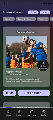
Problem: Users want to search by keywords, not just filters, to find events
Home Screen, Iteration 1:

Problem: It was unclear to some users that the interest tags (chosen by selecting interest filters) directly affect the "Like-minded people are attending" recommendations
Home Screen, Iteration 1:
Problem: Users were unaware that they could swipe through event recommendation cards on the Home screen
Explore Screen, Iteration 2:

Solution: Add “search by keyword” search bar to Explore screen
Home Screen, Iteration 2:

Solution: Reduce redundancy and shorten the scroll by eliminating the "Your interests" title since the title already corresponds to the "Like-minded" recommendations
Home Screen Overlay, Iteration 2:

Solution: Add an informational overlay when users first log into the app instructing them to swipe through cards
FINAL WIREFRAMES
Solving for the Anxious Event-Goer
Browsing Events from Home Screen:
Insight: Users want to attend events but often don’t follow through due to social anxiety, unclear expectations, and the perceived cost of time, money, and energy.
-
Reduce Cognitive Load during Discovery:
-
Swipeable, single-event cards limit decision-making to one option at a time.
-
Key logistics are surfaced upfront (location, time, cost, attendee count), which helps users quickly assess feasibility before committing.
-
-
Reframe Social Proof to Reduce Anxiety:
-
Language emphasizes “like-minded people are attending” instead of urgency or popularity.
-
Attendee counts and first-time attendee indicators normalize solo attendance, which reassure users without creating pressure or fear of large crowds.
-
-
Separate Relevance from Psychological Safety:
-
Filters are split into Hobbies/Activities and Event Qualities
-
Event Qualities (e.g., alcohol-free, age-inclusive, ally-friendly) allow users to pre-screen comfort, which supports anxious users in evaluating how the event will feel, not just what it is.
-
Result: Transplant shifts from optimizing for discovery to optimizing for follow-through—helping users make confident, informed commitments they are more likely to honor in real life.
Viewing Event Details and RSVP'ing:
Insight: Users are most likely to drop off after RSVPing if expectations feel unclear, social dynamics feel risky, or the real cost of attendance (time, energy, money) becomes apparent too late.
-
Make Social Dynamics Visible before Commitment:
-
Attendee breakdown is visually emphasized (solo vs. bringing friends, first-time vs. returning).
-
Total attendee count is shown prominently, which helps socially anxious users anticipate the environment and normalize solo attendance.
-
-
Emphasize Social Proof
-
Event qualities are displayed as badges (e.g., Alcohol-free, LGBTQ+-friendly).
-
User reviews are highlighted, which allows users to assess tone, crowd energy, and inclusivity through peer language.
-
-
Reinforce Commitment post-RSVP:
-
Confirmation screen restates key details (what, where, when).
-
Next step CTA (“See your events”) anchors follow-through, which helps users mentally lock in the plan and reduces forgetfulness.
-
Result: The event detail and RSVP flow replaces uncertainty with clarity—making social dynamics, expectations, and effort visible before commitment—so users RSVP only when they are realistically prepared to attend.
Browsing Events from Explore Screen:
Insight: Users want autonomy in discovery, but too many open-ended choices increase anxiety and lead to indecision. To convert exploration into real-world attendance, users need bounded choice, clear constraints, and the ability to plan around time, cost, and energy.
-
Use Progressive Disclosure to Prevent Overwhelm:
-
Filter groups (Category, Time, Cost, Location, Interests, Environment) are collapsed by default.
-
Expandable sections with selection counts (e.g., Category (2), Time (1)), which keeps the interface calm while still offering depth and control.
-
-
Support Emotional Comfort through Environment/Event Qualities Filtering:
-
Environment filters (Bar/Lounge, Café, Co-working, Gallery/Museum, Indoor) allow users to pre-screen the social atmosphere, a key factor for solo attendees.
-
-
Reinforce User Agency Post-Filtering:
-
Applied filters are displayed as chips at the top of results.
-
Immediate visual feedback is present in updated event cards, which reassures users that results reflect their boundaries and preferences.
-
Result: The Explore flow transforms open-ended browsing into intentional planning—helping users narrow options based on real-world constraints so exploration leads to confident RSVPs rather than decision fatigue.
Confirming RSVP from Push Notification:
Insight: Many no-shows aren’t caused by loss of interest, but by forgotten plans, shifting energy levels, or lack of a low-friction way to reconfirm or opt out. Timely, respectful reminders increase follow-through when they reinforce commitment without inducing guilt or pressure.
-
Normalize Opting Out without Penalty
-
Choices are presented as a simple binary with equal-weight (“Going”/“Not Going”).
-
Neutral visual hierarchy avoids shaming users into false confirmation, which improves attendance accuracy and protects community trust.
-
Push notification is framed as confirmation, not a warning or countdown.
-
-
Make Expectations Explicit at the Point of Confirmation:
-
There is clear restatement of event details (what, where, when).
-
Explicit time remaining to confirm (“12 hours left”) prevents accidental non-attendance due to forgotten logistics.
-
Result: This flow treats reminders as a coordination tool—not a pressure tactic—allowing users to reconfirm attendance when it matters most, leading to fewer no-shows and more reliable in-person participation.
SUMMARY
Most event platforms focus on maximizing discovery and RSVPs, but research with people new to a city revealed a different problem: users often fail to attend not due to lack of interest, but because uncertainty, social anxiety, and unclear expectations make follow-through feel risky. Transplant was designed to address this gap by prioritizing structure, predictability, and transparency across the entire experience—from discovery to RSVP confirmation—so users can confidently assess whether an event is truly realistic for them.
Transplant surfaces concrete logistics, social dynamics, and environmental context upfront, helping users mentally simulate attendance before committing. Filters and event details are organized around real-world constraints like time, cost, location, and psychological comfort, while attendee breakdowns and event qualities reduce anxiety around attending alone. By supporting honest commitment and timely reconfirmation rather than optimistic sign-ups, Transplant stands apart from existing event platforms and converts far more reliable RSVPs into real-life attendance.
Closing the Gap between RSVPs and Attendance