
DESIGN SPRINT, 2025
PostUp
Role: Product Designer, User Experience Researcher
Overview
Remote workers often struggle to find reliable public workspaces. Existing platforms (like Google or Yelp) prioritize food and beverage reviews over environment-specific details such as WiFi quality, outlet availability, seating space, and noise levels.
As a design sprint challenge, I was tasked with designing and testing a mobile solution to help remote workers find public workspaces that match their unique needs.
Contents
Final Prototype
DAY 1
Mapping the Problem
To kick-off the research and ideation process, I conducted a series of interviews with individuals who work remotely and like to find out-of-home workspaces. These interviews revealed the following themes.
Proximity as a Search Starting Point:
Users consistently prioritize proximity when searching for a workspace, using location as their primary filter before evaluating other factors. Many begin their search in a map view, scanning nearby options to minimize travel time and mental overhead, especially when fitting work sessions into a busy day.
Importance of Photos:
Photos play a critical role in helping users assess whether a space is suitable for working. Users rely on multiple images to understand layout, seating density, lighting, and overall atmosphere, with a strong preference for customer-provided photos that feel more transparent and trustworthy than curated venue shots.
Amenity Information Is Critical:
Clear, upfront amenity information strongly influences whether users consider a space viable for work. Details like hours, table availability, WiFi quality, power outlets, and bathroom access help users quickly determine fit and avoid uncertainty that could derail their decision.
Typical Reviews are a Pain Point:
Traditional venue reviews are largely focused on food and drink, making them insufficient for evaluating work suitability. As a result, users struggle to extract relevant signals about noise levels, seating comfort, or laptop-friendliness, creating friction and additional research effort.
DAY 2
Sketching Solutions
To understand how users currently discover, evaluate, and decide on work-friendly spaces, I analyzed established location-based platforms (Yelp) alongside niche workspace tools (Gable). This helped identify both familiar interaction patterns users expect and gaps that present opportunities for differentiation.
Yelp:


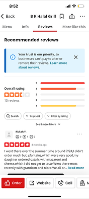
-
Navigation and Orientation:
-
Yelp uses a fixed, clearly labeled bottom navigation, reinforcing consistent task-based browsing across screens.
-
-
Visual Search Results:
-
Listings rely heavily on user-submitted photos and preview text, making results easy to scan and compare at a glance.
-
-
Content Organization:
-
Business pages are segmented into clear tabs (Menu, Info, Reviews), enabling quick access to specific tasks without overwhelming users.
-
-
Visible Availability:
-
Hours and open/closed status are surfaced prominently, allowing users to instantly assess whether a location is viable.
-
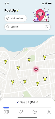
Gable:


-
Map-First Discovery:
-
Gable defaults to a map view with nearby spaces surfaced immediately, reinforcing spatial context as the primary decision driver.
-
-
Flexible Browsing Modes:
-
Users can quickly toggle between Map and List views, supporting both visual exploration and text-based scanning.
-
-
Scannable Filters and Amenities:
-
Filters are accessible without being overwhelming, with amenities communicated through clear iconography.
-
-
Image-Led Results:
-
Listings are presented as image-first cards with essential details surfaced upfront, enabling fast visual comparison.
-
The next phase of my process was a round of Crazy 8s sketches, focused on exploring different ways to visualize a map-forward, location-detailed interface. The goal was to quickly test variations in how maps, search, and location cards could work together, helping me identify the strongest approaches for making workspace discovery both intuitive and context-rich.
Knowing that users will likely want to start with a map view, I experimented with ways of displaying a combination of a map view and cards detailing the workspaces in the proximity.

DAY 3
Storyboarding
For the next phase of ideation, I pinpointed a starting point from the sketches I made the day prior and built out the idea into a storyboard. The storyboard below illustrates a filtering and location selection flow, with the user starting on the explore (home) screen, filtering for a space based on amenity preferences, selecting one of the results from the map, and viewing the location detail screen.
Selecting a Workspace:

DAY 4
Prototyping
Once the storyboard was finished I designed the high-fidelity wireframes for this redroute. Although designing out the brand was not required by the brief, I wanted to use illustrations and a minimalist style to keep the interface attention-grabbing while remaining clean.
Home Screen:


Search by name/keyword, filter search results
Workspace preview card, appears on selection of location tag
Location Detail Screen:

Most crucial information is surfaced at the top of the scroll: proximity, hours, availability
Photo gallery
Customer reviews
List of amenities to help user make informed choice about whether or not the location meets their needs
DAY 5
User Testing
For the PostUp user testing sessions, I performed four moderated, in-person user tests to determine the level of ease with which users would be able to find a workspace that fits the needs of a remote worker.
Testing task: Find and save a café within a mile of you that has WiFi, power outlets, and outdoor seating.
Home Screen, Iteration 1:

Problem: Testers pointed out that they want to see a visible indicator of their position on the map, to better understand proximity
Filter Screen, Iteration 1:

Problem: The "apply filters" and "clear all filters" CTAs lacked visual weight and didn't immediately trigger recognition from users
Home Screen, Iteration 2:

Solution: GPS-tracking icon added to the map to represent the user's active location
Filter Screen, Iteration 2:

Solution: "Apply filters" CTA redesigned to be more prominent
FINAL WIREFRAMES
Highlighting Proximity, Amenities
Finding the Perfect Workspace:
I designed the home screen to function as a map of the user's GPS location with a search bar and filter functionality.
Users can filter the results for work spaces in their proximity by space type, distance, and amenities.
The screen displaying each work space is designed to highlight more about the space than what can be gleaned from traditional search methods, such as the space's real-time capacity and reviews from users who are also reviewing on the criteria of the space's suitability for remote work.
Photos of the space and a list of amenities such as outlets and WiFi are also displayed.
SUMMARY
This design sprint challenged me to rapidly ideate, prototype, and test a solution for remote workers struggling to find suitable public workspaces. By grounding the process in user insights, I was able to prioritize a map-forward interface with clear filters and detailed location information—features that directly addressed frustrations uncovered in research.
The iterative approach, from Crazy 8s sketches through high-fidelity prototypes, allowed me to quickly explore possibilities and validate solutions with real users. User testing highlighted the importance of clarity and visibility in the interface, leading to key refinements such as adding a location indicator and improving filter CTAs. Overall, the sprint demonstrated how a focused, user-centered process can produce a functional and intuitive product concept within a short timeframe.
Simplifying Workspace Discovery