
Transplant
UX/UI DESIGN, 2025
Overview
A startup focused on helping people form new in-person friendships has identified a gap between RSVP numbers and actual event attendance—only about 20% of those who commit to an event end up going. The startup aims to ease the challenges of making friends in a new city, and accordingly, the core of its user base is made up of socially anxious individuals (particularly middle-class adults aged 32–55) who have recently relocated.
The business goal is to reduce the gap between RSVP numbers and actual event attendance through better communication and low-cost incentives. The brand seeks to connect with users as a trusted, optimistic, and caring friend, drawing inspiration from platforms like Meetup, Facebook, and Eventbrite.
Contents
The Question
Research
Ideation
User Testing RD 1
Visual Identity
Final Wireframes
User Testing RD 2
Summary
Final Prototype
THE QUESTION
What causes user drop off between RSVPs and actual event attendance?
RESEARCH
User Interviews
To better understand why a user may RSVP to an event without attending, I conducted a series of interviews with individuals who match the startup’s target audience. These interviews revealed the following themes.
Desire for Structure and Predictability
Users overwhelmingly preferred structured events with clear activities or timelines—like trivia, sports, workshops, or climbing—because predictable formats lower social pressure, reduce anxiety, and make it easier to mentally prepare and commit compared to unstructured mixers.
Social Anxiety around Solo Attendance
Users are hesitant to attend events alone, and pre-event anxiety—especially when it’s unclear whether solo attendance is normal—creates a major barrier, making them far more likely to follow through when they have a companion or know others will also be attending solo.
Need for Specific, Transparent Event Details
Users are far more likely to commit when event listings clearly communicate details like expected crowd size, audience type, social expectations, schedule, and whether alcohol is involved—since vague or incomplete information creates uncertainty and drives drop-off.
Cost, Time, and Energy Investment Matter
Users are more willing to attend when events are low-cost, low-effort, and nearby—since uncertainty about enjoyment makes them unwilling to risk more than $10–20 and pushes them toward approachable, low-commitment options.
RESEARCH
Competitive Analysis
To understand how existing event-discovery platforms engage users, I analyzed Facebook Events, Eventbrite, and Meetup across onboarding, discovery, event details, and RSVP flows. Eventbrite excels in clarity and hierarchy—its ticketing and checkout experiences reduce friction and communicate trust—but it risks overwhelming users with multiple sign-in prompts and visual clutter.
Facebook Events drives strong engagement through social context (“friends are interested”), yet its interface suffers from excessive visual noise and ambiguous RSVP language. Meetup offers personalization through interest tags and community-based discovery, but its event surfaces feel fragmented and often gate participation behind group membership, creating barriers to entry.


Across all three, common challenges included information overload, inconsistent social proof, and limited personalization transparency. However, their strengths informed key opportunities for Transplant: simplifying event browsing through focused filters, offering multiple engagement levels beyond “interested” or “going,” and surfacing social motivation cues without sacrificing clarity. These insights shaped design priorities around trust, simplicity, and community belonging—making Transplant a more streamlined and emotionally intelligent event platform.
RESEARCH
User Personas

DANA, 38 F
“I want to go out more, but I always talk myself out of it — it’s hard when you don’t know what to expect or who to go with.”
Frustrations:
-
Event listings feel impersonal and overwhelming
-
Doesn’t know how to gauge the “vibe” of an event beforehand
-
Experiences “RSVP guilt” — signs up, then cancels last minute due to nerves
Goals:
-
Find approachable, small-scale events that feel inclusive
-
Connect with people who share authentic interests
-
Reduce anxiety around showing up alone or not knowing anyone

MARCUS, 47 M
“If I could see which events I actually enjoy and which help me meet people I connect with, I’d go out twice as often.”
Goals:
-
Discover events that align with specific interests
-
Track attendance history and engagement over time
-
Build and maintain social routines
Frustrations:
-
Event listings feel random and inconsistent
-
Wants to access information about other attendees without having to pay for a subscription
IDEATION
User Flows
After initial user research, I mapped user flows to clarify how people decide to RSVP based on confidence in their interest. My hypothesis: the more assured users feel about enjoying an event—and the more prompted they are to update their RSVP—the smaller the gap between RSVPs and actual attendance.
Selecting and RSVP’ing to an event

Confirming your RSVP from notification

USER TESTING: RD1
Low-Fi Test Findings
I turned my user flows into low fidelity wireframes and performed three user testing sessions to stress-test my ideas. The following are the strongest insights I gained from this round of testing.
Home Screen:
%201.png)
First event options shown on home screen do not reflect user’s interests, though user interests are the most important factor in choosing event
Testers appreciated the inclusion of "number of first time attendees"
Testers expect "Your Interests" to be present at the top of the scroll if it dictates recommendations
Event Screen:

Testers want to see as many photos as possible of past meetups/venue
There was slight confusion about the redundancy of these tags with the tags below
Testers liked this detail
Testers would rather see information about how laid back or structured an event is
Solutions:
-
Switch the order of “New and Trending Events” and “Like-minded People are Attending”
-
Move "Your Interests" filter to the top of the page
-
Reconceptualize the "what to know" section with a visual that will better describe the event's vibe, provided by host
-
Add a photo gallery
VISUAL IDENTITY
.png)
USER TESTING: RD2
High-Fi Test Findings
Next, I developed a high-fidelity prototype and performed four testing sessions with the prototype to make sure that the process of finding an interesting event, and RSVP’ing to it, is seamless and intuitive. Below are the changes that I made from the first to the second iteration of high-fidelity wireframes in accordance with the insights from the second round of testing.
Problem: Users want to search by keywords to find events.
.png)

Solution: Add “search by keyword” search bar to Explore screen. I also added a "sort by" icon to allow users to sort results by relevance and date.
Problem: Some users couldn’t determine the state of confirmation buttons.


Solution: Change toggle direction and color of RSVP confirmation buttons to better indicate progress.
Problem: Users don’t understand what an “attendee rating” is.

Solution: Add “learn more” selection text underneath mention of “attendee rating” in disclaimer, and add corresponding explainer screen.
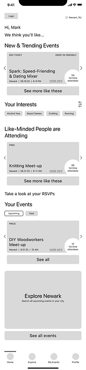
FINAL WIREFRAMES
Solving for the Anxious Event-Goer
The Transplant "Home" screen surfaces personalized event recommendations based on users’ interests, supported by filterable event cards that highlight key details like date, time, cost, location, and expected attendance. A streamlined dashboard keeps upcoming RSVPs and past events front-and-center, with a clear path to browse more through “Explore (Your City).”
To strengthen follow-through, the screen integrates an attendee rating system for limited-capacity events and an accountability prompt that encourages users to update RSVPs when plans change.
The "Explore" screen offers a dynamic search experience where users can browse events by keyword, category, time, cost, attendee demographic, and interests. Its filtering system is shaped directly by user interview insights, prioritizing logistical fit and social compatibility. This ensures users can quickly surface events that align with both their practical needs and the type of people they want to meet.
The RSVP push notification flow uses smart notifications that surface key event details and prompt users to confirm or update their plans directly in the app. This quick interaction reduces friction and keeps users accountable without adding effort. By making it just as easy to opt out as to commit, the system meaningfully reduces RSVP drop-off while supporting more accurate attendance.
SUMMARY
This creative brief was an interesting challenge, and I believe that the features I incorporated to 1. Make information about events as transparent and thorough as possible in order to help users set expectations, and 2. Give users consequences for no-showing without updating their RSVP accordingly, have potential to mitigate a large number of RSVP no-shows.
Testing confirmed high user satisfaction and verified the MVP's market viability. These outcomes positioned the product as a clear success.
Closing the Gap between RSVPs and Attendance